User Experience Design, Information Architecture and Quality Assurance
Apr 2022 - May 2022 (6 weeks)
2
iTaipei, previously used for various Taipei City Government services, has been optimised and rebranded as TaipeiPass. T Radio is one of the features and requires a redesign.
It is a streaming service from Taipei Broadcasting Station, a public radio station managed by the Taipei City Government. The station offers a wide range of programs that emphasise local culture, social welfare, and community topic.
TaipeiPASS integrates various municipal services, connecting citizens with the government through digital identity verification and authentication mechanisms, providing convenient online and offline applications and payment tools for daily life.
Heuristic Evaluation
Visibility of System Status
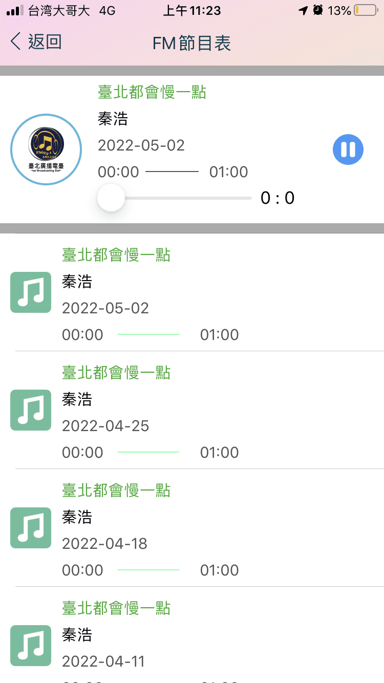
No progress bar is displayed when users replay, so they cannot tell how much of the show they have listened to.
Recognition Rather Than Recall
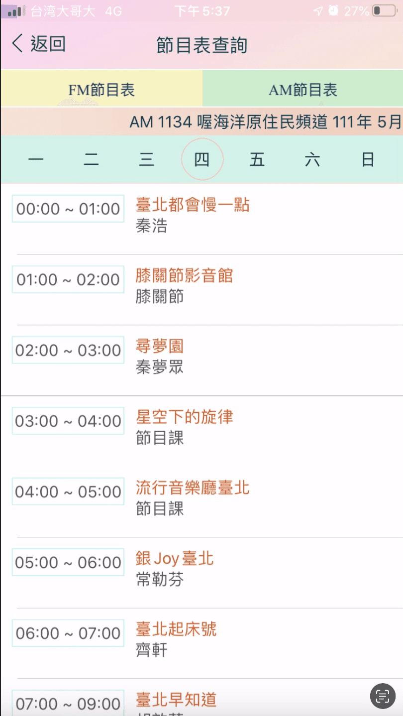
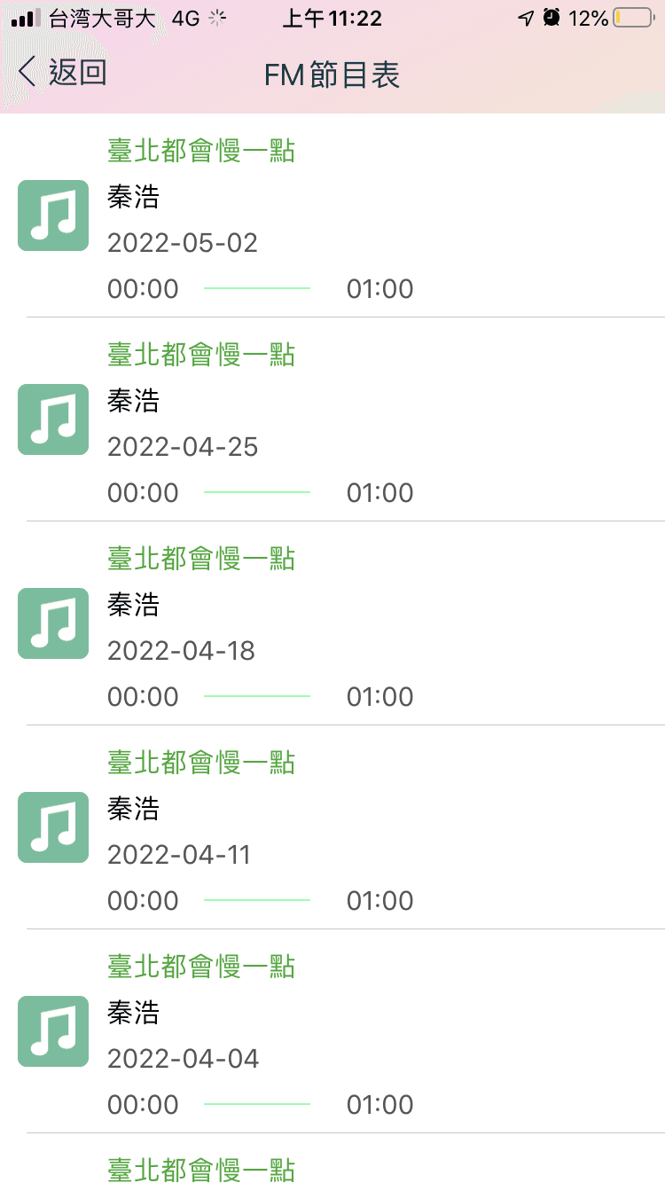
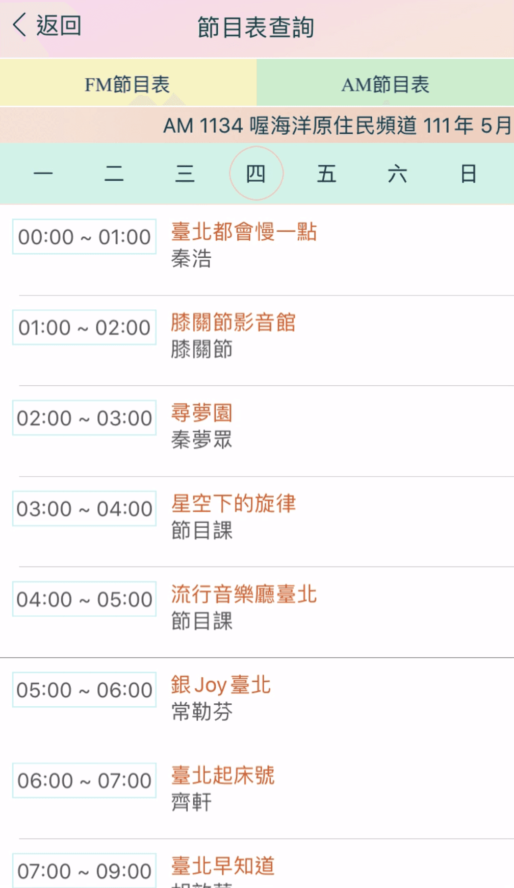
With two channels and 56 programs, users may find it challenging to navigate the schedule to locate their favorite shows.
Aesthetic and Minimalist Design
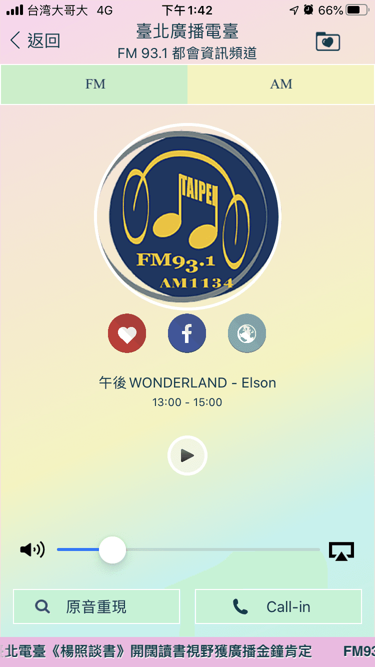
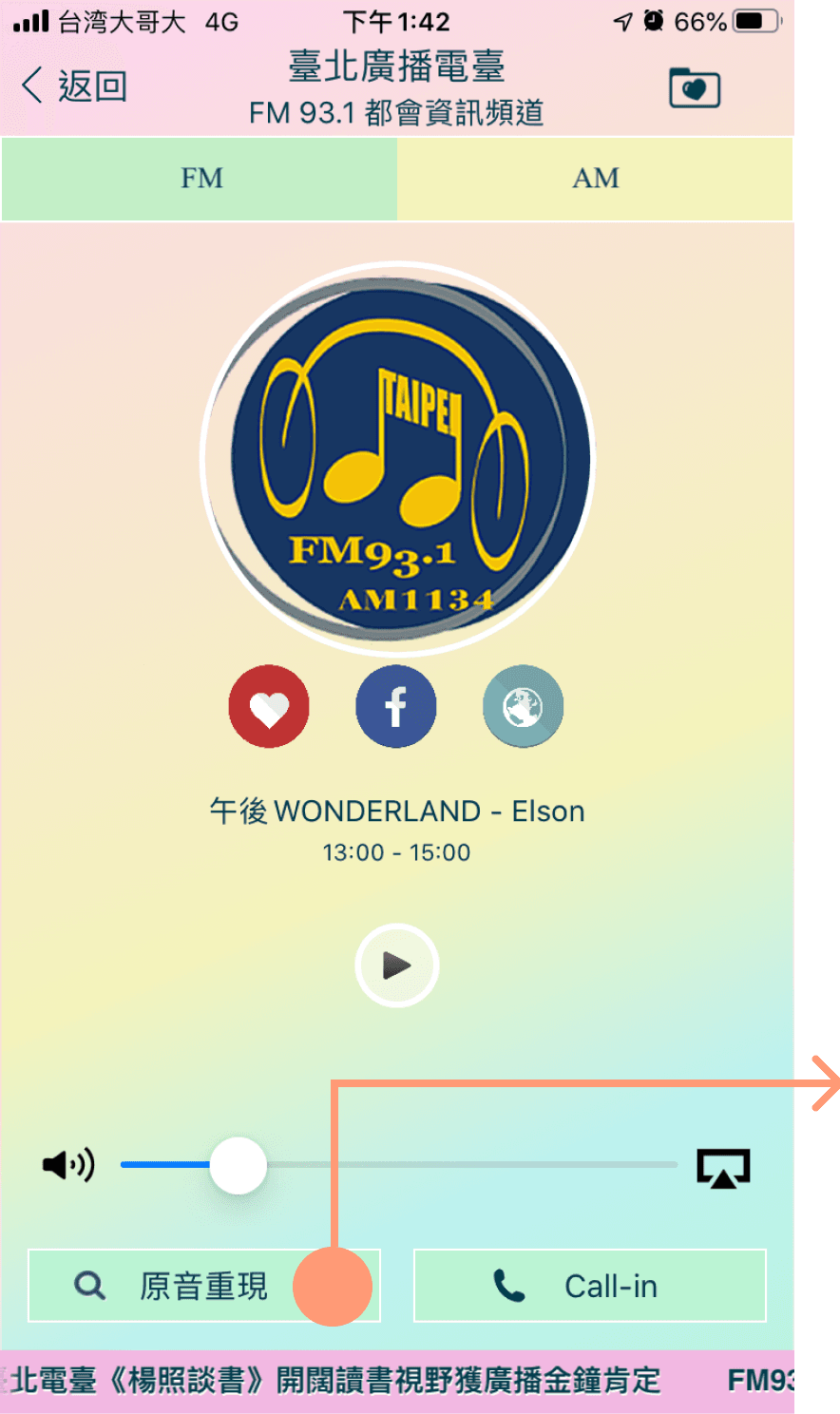
A non-functioning button may distract users from achieving their goal, and the lengthy paragraph is difficult to read. (PIC 1 & 2)
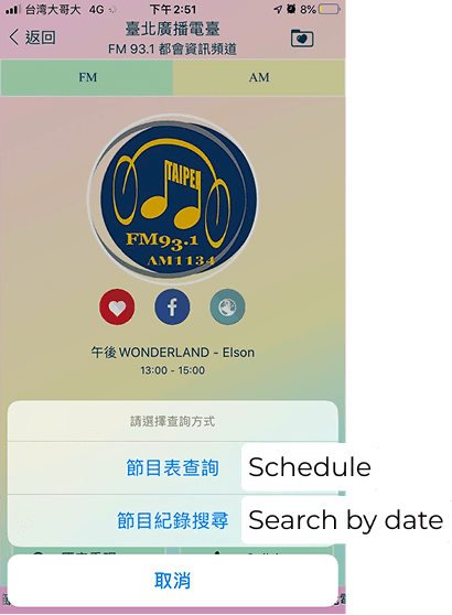
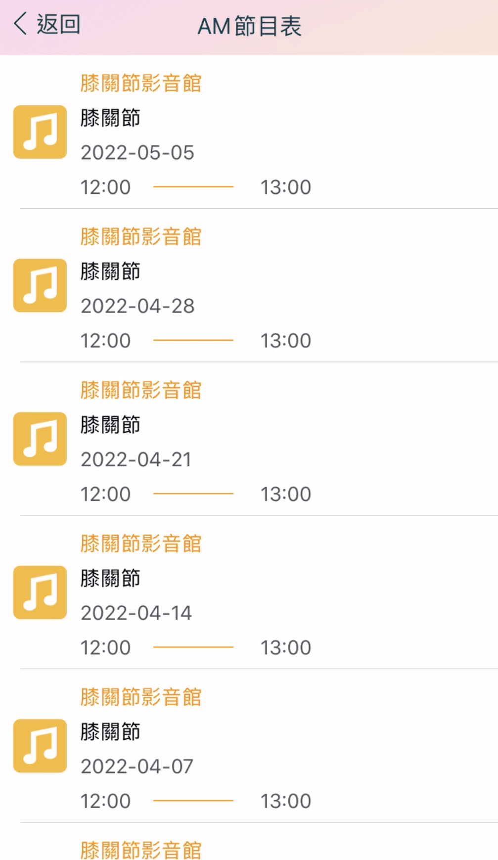
At first glance, the rows appear to have similar content and lack emphasis on informational differences, making it difficult for users to distinguish between them and locate the episodes they need. (PIC 3)
Accessibility Evaluation
Touch Target Size and Spacing
When the target size is too small, accurately selecting or aiming at it can become difficult.
Users with hand tremors, limited dexterity, or other challenges may struggle to interact with small targets.
Provide clear indication that elements are actionable
Interactive elements that initiate changes should be clearly distinguishable from non-interactive elements.
If they are not, it can make the site significantly harder to navigate, potentially causing confusion and increasing the cognitive burden for individuals with cognitive impairments.
I designed the app based on stakeholder feedback, trying to meet their requirements for the project.
Taipei Broadcast Station
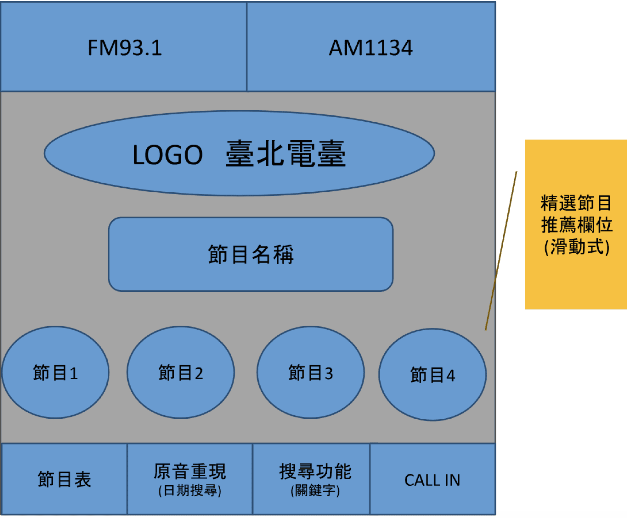
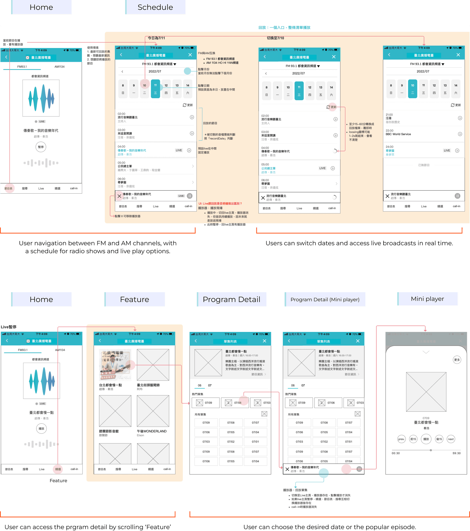
Schedule
Search by date
My Repsonse
Commissioner of Department
The commissioner finds it easy to navigate programs by swiping the images.
He suggests including more content and restructuring the layout.
He also recommended removing the "Popular Programs" section, as the bottom overlay takes up too much space.
This is screenshot of lite version.
Popular Programs
My Repsonse
Develop Team
My Repsonse

Discover and follow top global podcasts with expert curation and personalized recommendations
4.7
+ The intuitive design makes navigation straightforward.
+Interface clear and easy to use
+ Personalised recommendations have been well-received
-Locating certain programs can require multiple steps
-Some users found the content too fragmented, requiring constant back-and-forth to access playlists, episodes, or live shows.
-Dialing interface is unfriendly
Access millions of top podcasts with curated suggestions and personalised picks.
4.9
+Interface clear and easy to use
+ Filtering is incredibly easy.
+Available in many languages
-Only apple user can access to the app
-Some users felt that content was too fragmented
With more than 200 countries available, there are many kinds of stations for you to choose from.
4.7
+ Mini player allows for easy access and control, enabling users to change or pause music conveniently without disrupting other activities.
+Efficient Search Functionality
-Some users feel the visual design is outdated. Users find oversized icons unnecessary and cluttered and reminiscent of older design styles.
- Too many ads
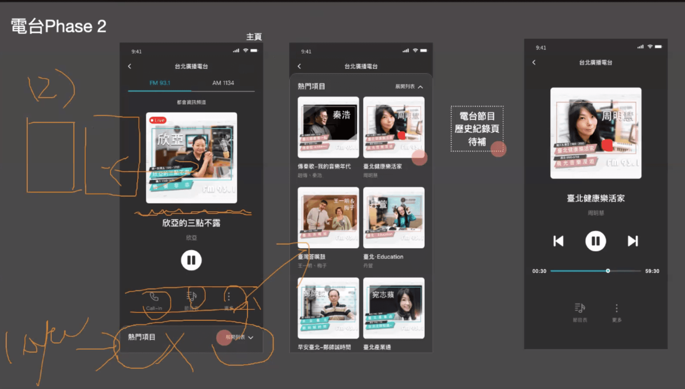
Homepage
Before
After
Based on uses' reviews and the preferences of the Taipei radio station, I re-organised the content and ensures a clear layout while maintain the main features.
Removed unnecessary buttons
Maintained a centered layout
Added a section for trending programs (Feature)
Kept 'Schedule'
Schedule
Before
After
Based on the preferences of the Taipei radio station and feature analysis, I keep the feature and iterate it.
In the feedbacks of iTaipei, users often struggled to identify which episode was playing. Therefore, the new version places greater emphasis on the status of program and even display "Live" to indicate the live show.
Program Detail
Before
After
To create a more engaging and intuitive user experience, I added program details to familiarise users with the content.
Previous: Displays only a list of episodes with basic time and date information.
Current:
Adds a program introduction section
Episodes are presented by month, with top episodes
Before
After

To enhance user understanding, the additional program details were added to provide comprehensive context for each show.
Search
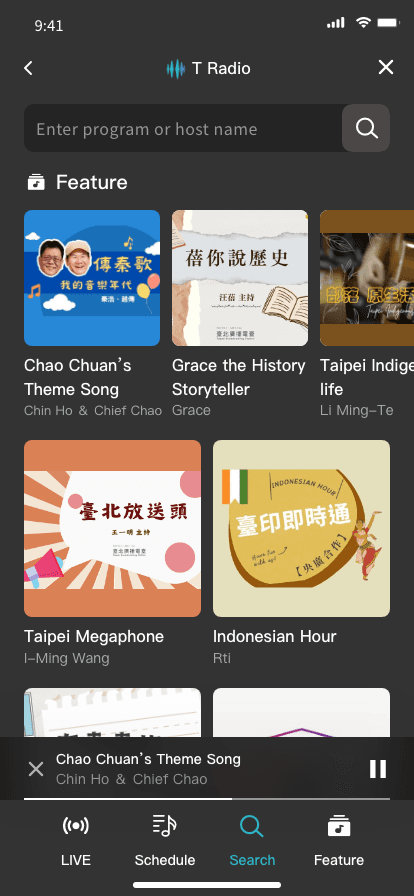
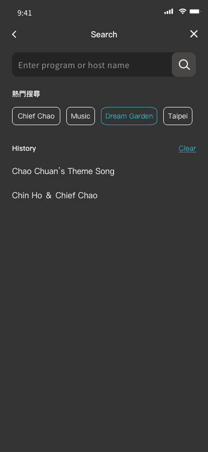
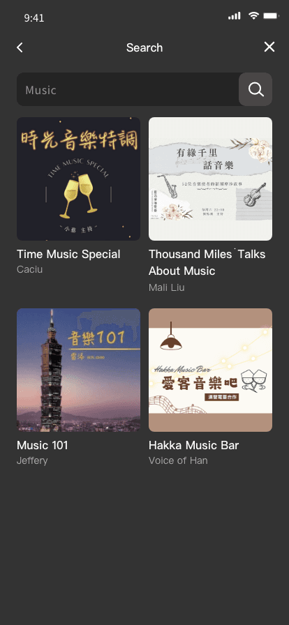
To help users easily find programs and since every app in the feature analysis includes a search function, I think it’s necessary to add this feature.
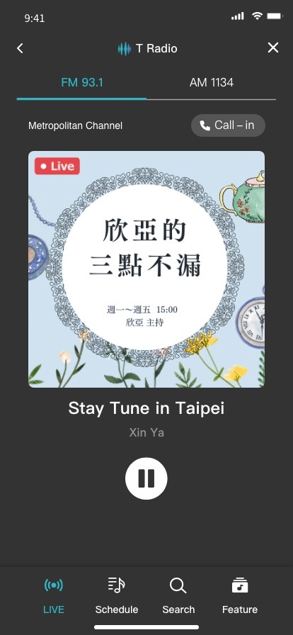
Mini Player
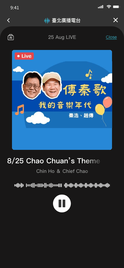

Through competitive and feature analysis, the mini player emerged as a key feature for streaming and entertainment apps. A review shown in the competitive analysis highlighted that the mini player improves usability by allowing users to easily pause or switch music without disrupting their current activity.